Challenge:
West 40 needed to communicate clearly to prospective clients that they are:
- A boutique, inspired, full service architecture and design studio
- Grounded in honesty of materials and contextual experience
- Modern in execution, yet timeless in approach
- Deeply relationship driven
At the same time, the brand needed to:
- Showcase the breadth and diversity of their project portfolio
- Highlight team, materials, process, renderings, blueprints, photography, and video
- Differentiate from the saturated Colorado architecture market
- Juxtapose modern sophistication with a subtle western sensibility that nods to place and longevity
The opportunity was to create a brand system that felt architectural in its own right. Structured, intentional, and enduring.
Response:
We began with extensive research, persona development, and visual exploration. Drawing inspiration from progressive architecture studios, strong geometric forms, and subtle western influences, I directed a visual system built on confident shapes and high contrast hierarchy.
Standing out was critical. Rather than defaulting to predictable architectural serif logos and flat monochrome palettes, we developed a refined identity with a slightly masculine, modern edge. The result is a brand that feels versatile, grounded, and unmistakably contemporary.
Every decision was intentional. From typography to color theory, the identity was designed to perform equally well in architectural presentations, printed materials, and digital environments. It bridges technical precision and lifestyle storytelling seamlessly.
What We Did:
Under my creative leadership, we developed a comprehensive and scalable identity system.
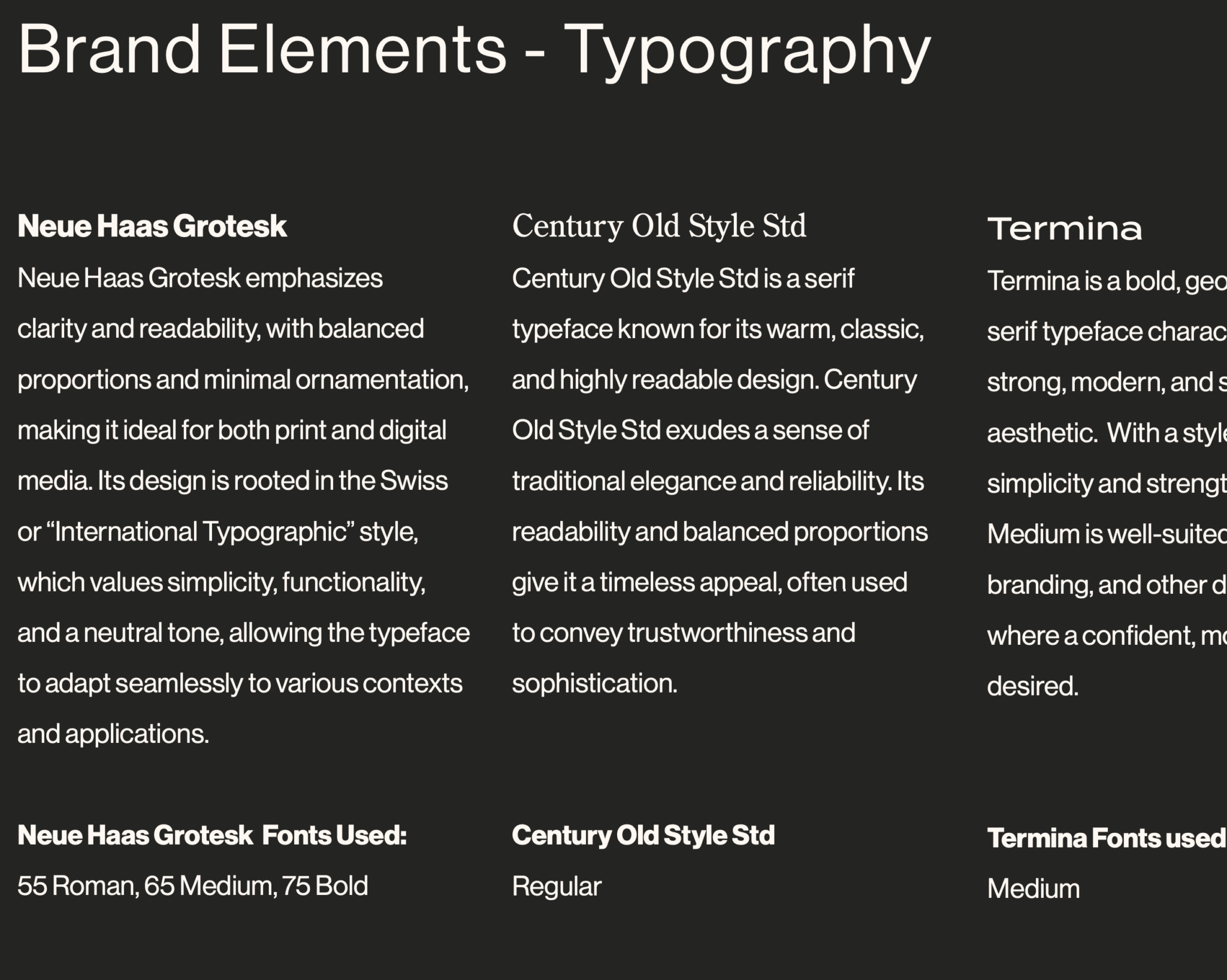
Typography
We built a custom type stack anchored by Neue Haas Grotesk for its clean modernism, paired with Century Old Style Std to introduce a sense of heritage and longevity. Termina was used as an accent and became the foundation for the logo direction. Together, the system balances precision and warmth.
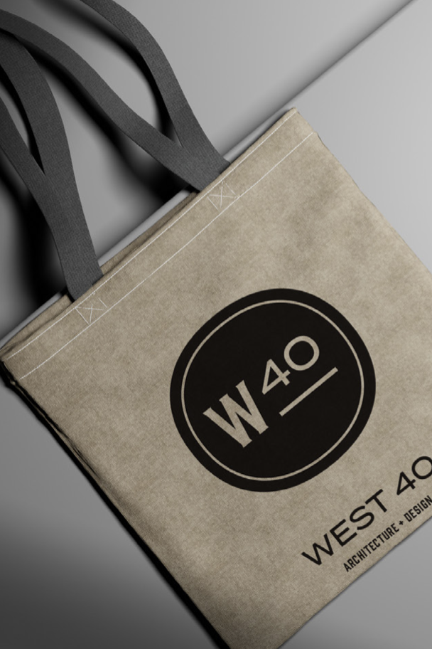
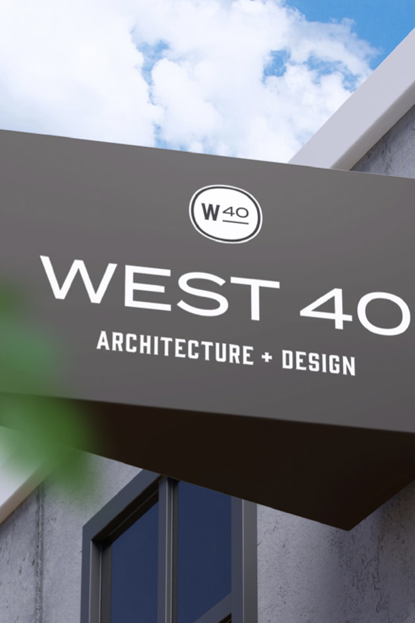
Logo System
We designed a flexible logo suite including primary lockups, stacked configurations, submarks, and a standalone logotype to ensure adaptability across digital, print, and environmental applications.
Color Palette
A mostly monochromatic, natural palette reinforces architectural restraint, while a carefully selected light blue accent introduces clarity and distinction without overpowering the work.
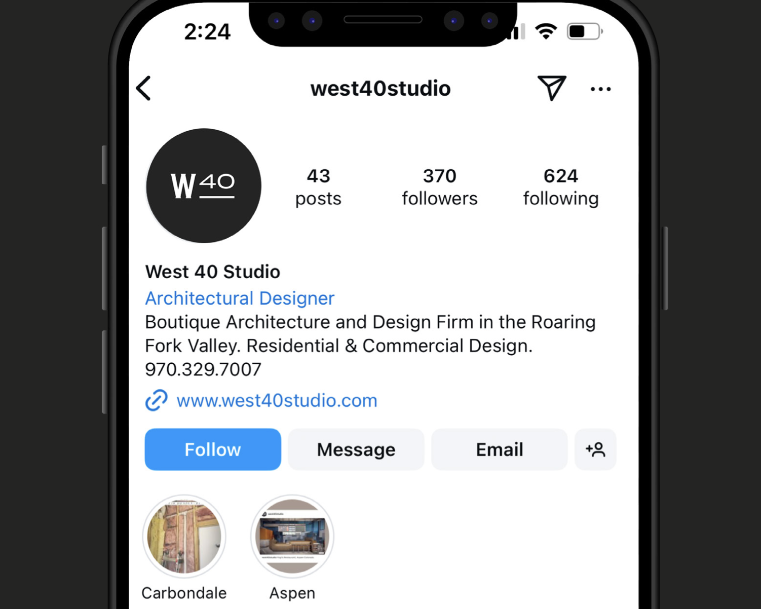
Brand Extension
The identity was rolled out across print collateral, branded materials, and other digital touchpoints to ensure cohesion in every environment.
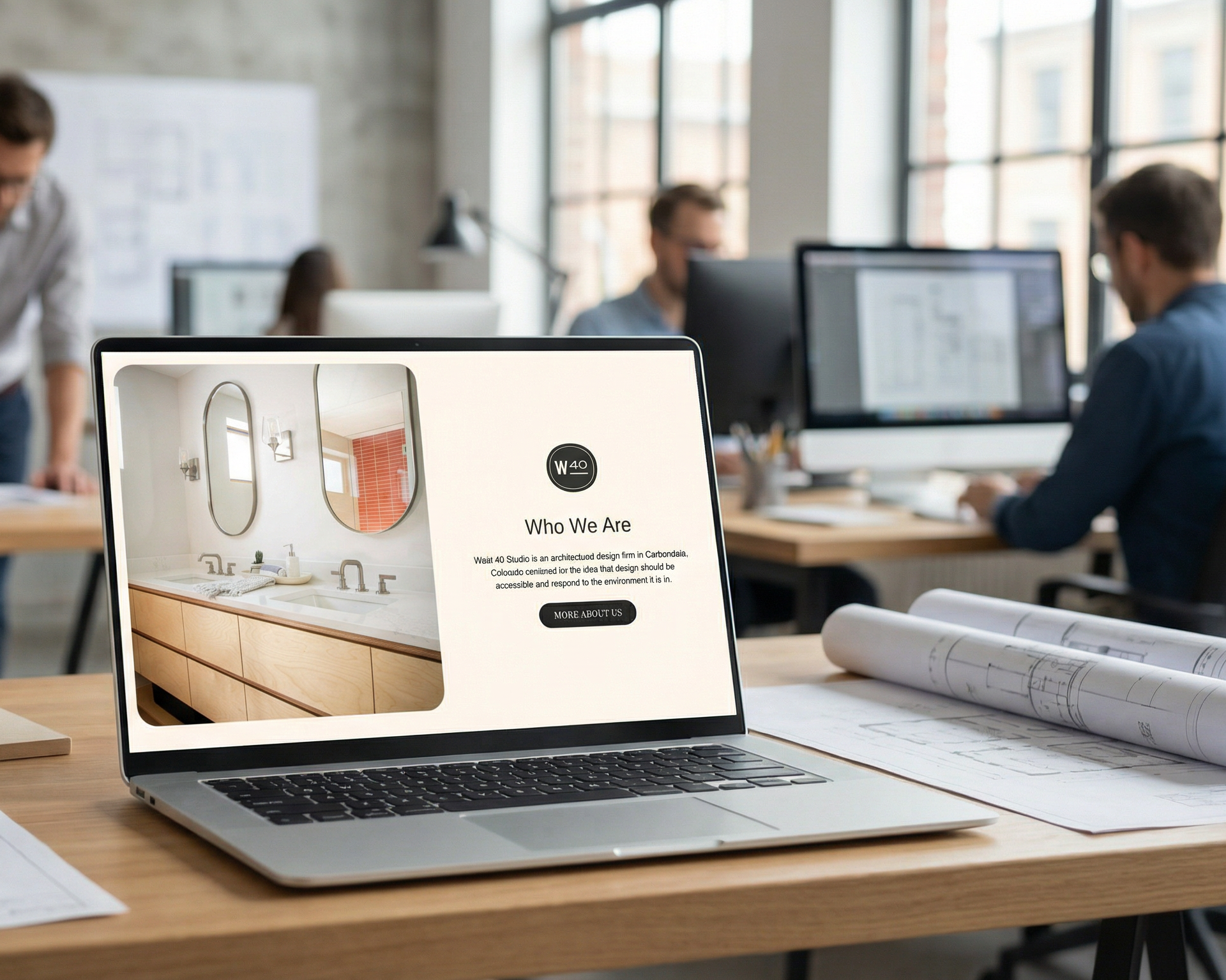
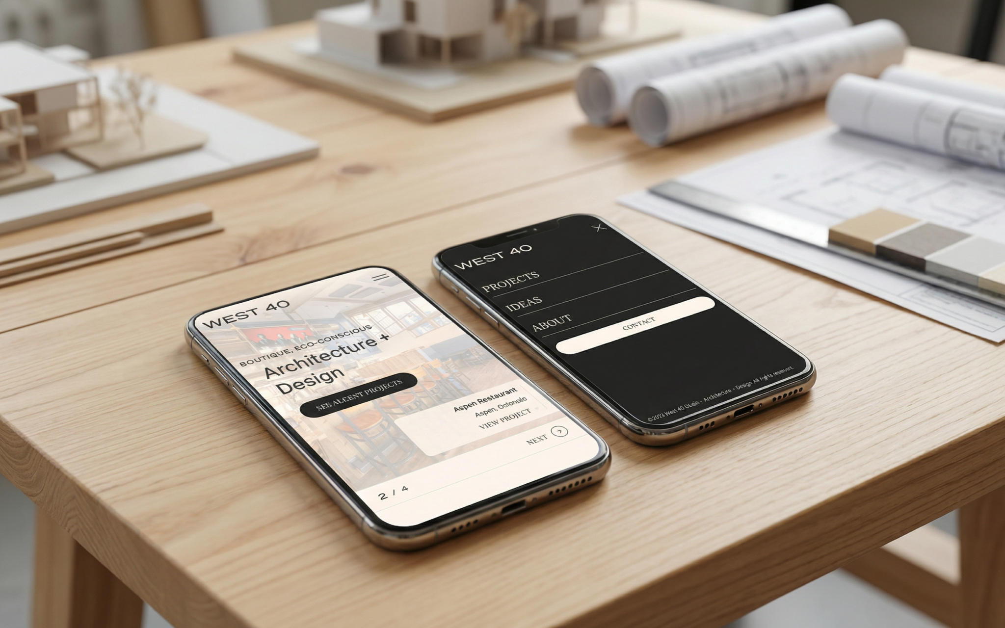
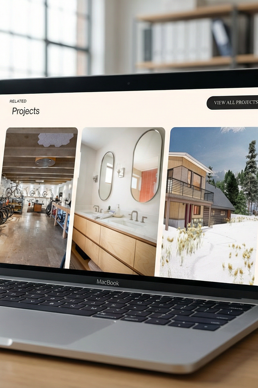
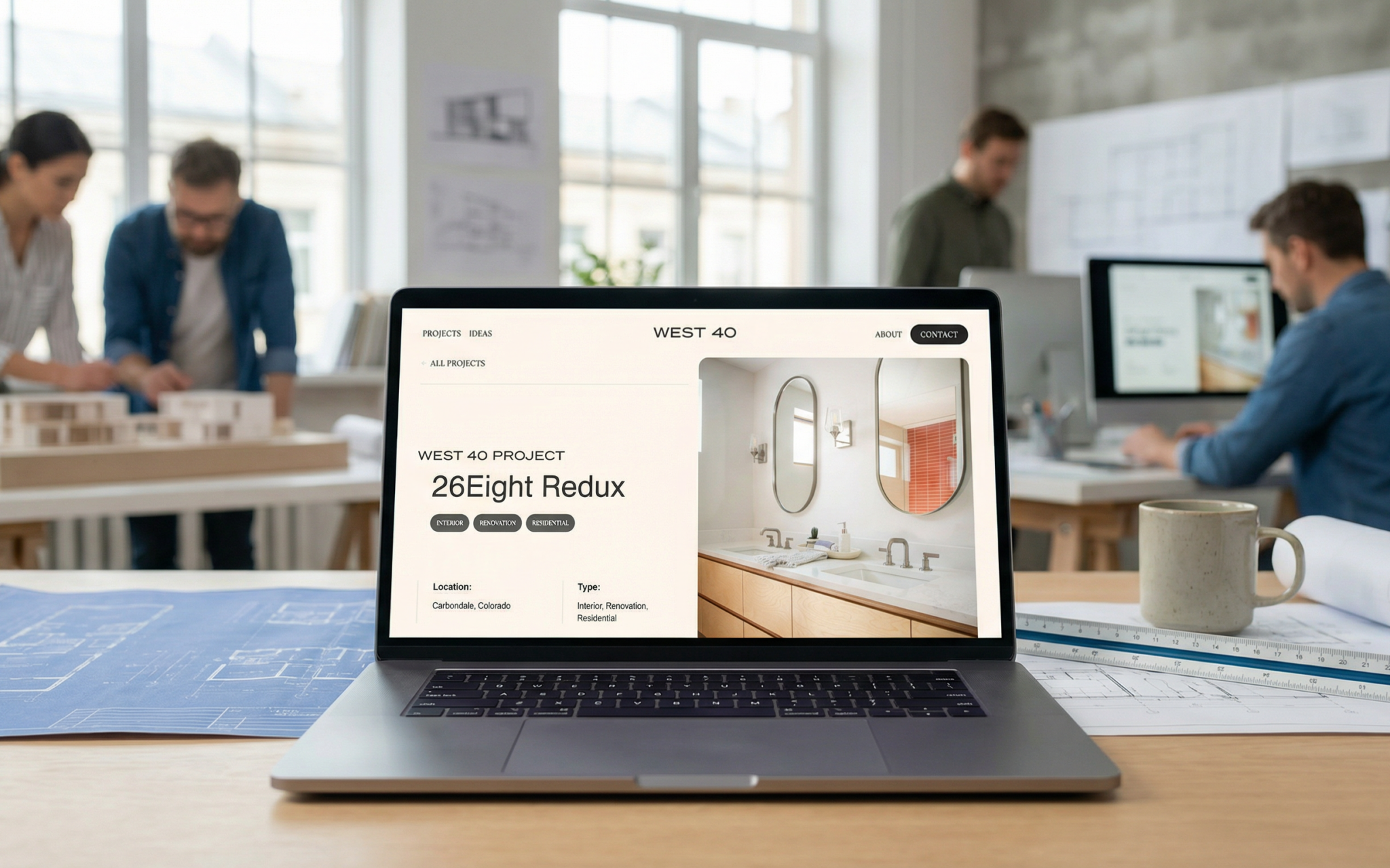
Website Design & Development
For the digital experience, I directed a clean, distraction free design that allows project photography and video to lead. The custom CMS platform was built for scalability, enabling the team to showcase detailed project narratives, materials, process documentation, renderings, and media coverage.
The UX was intentionally streamlined to encourage effortless exploration, allowing users to move fluidly through projects before being guided toward clear contact pathways.
Results:
West 40 Architecture + Design launched with a bold and differentiated presence in the architectural space. The rebrand positioned the firm as project led, design driven, and deeply rooted in sustainable modernism.
The cohesive identity system and scalable custom website empower the studio to grow alongside its expanding portfolio while maintaining brand consistency across markets.
West 40 is now digitally aligned with the caliber of work they produce, redefining what thoughtful, sustainable architecture looks like in Colorado and beyond.