Challenge:
The brand needed to communicate depth, heritage, and refinement without feeling traditional or restrained.
Key goals:
- Express the fusion of cultural tradition and contemporary execution
- Create a refined yet human identity suited for exclusive dining experiences
- Build visual consistency across events, social content, and brand materials
- Position the concept as premium, intentional, and story driven
Response:
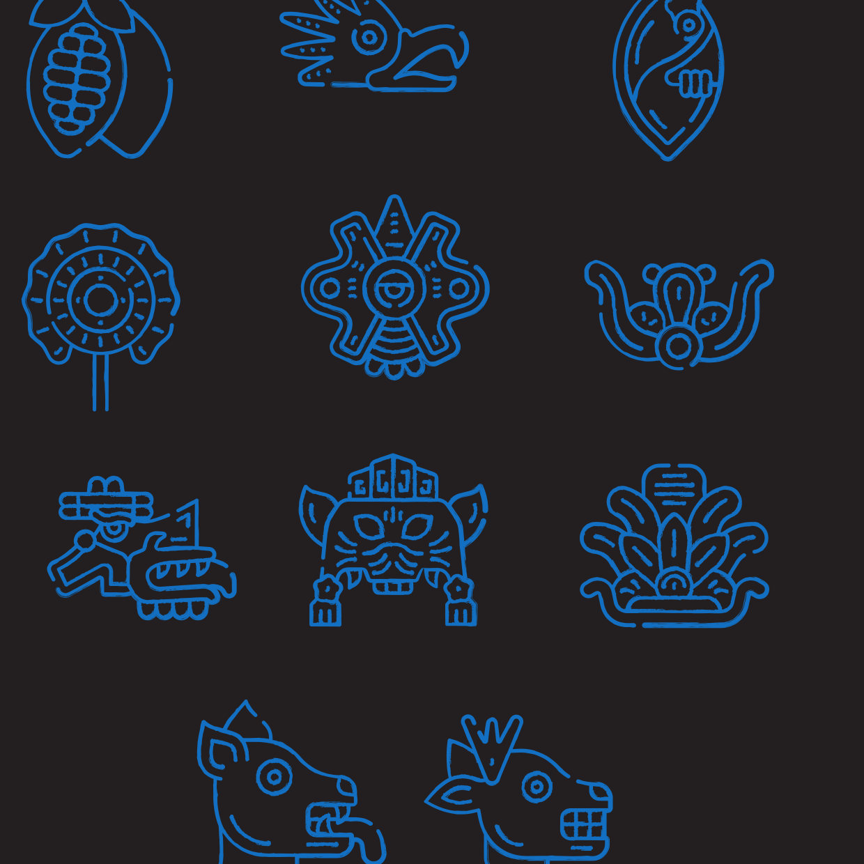
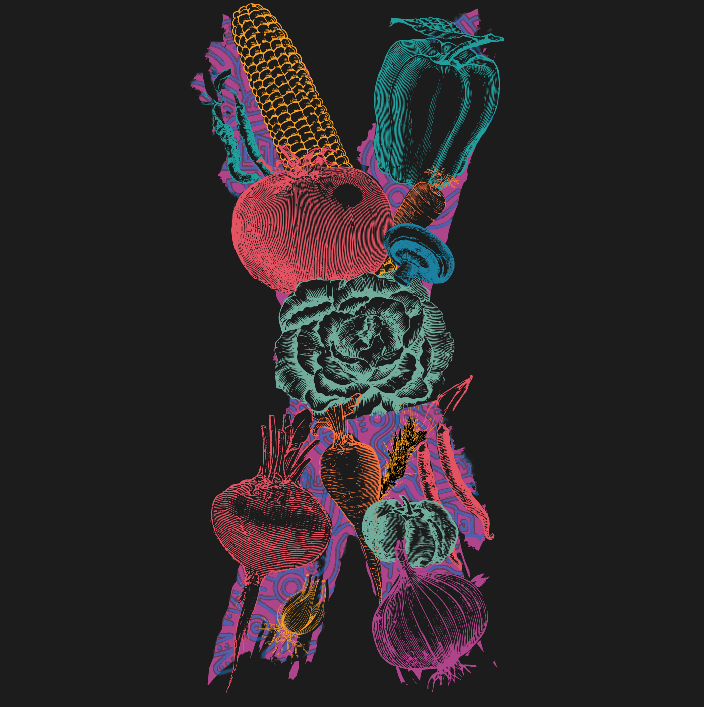
The identity direction focused on contrast: historic texture paired with modern structure. Inspiration was drawn from traditional printmaking, culinary symbolism, and minimal editorial design.
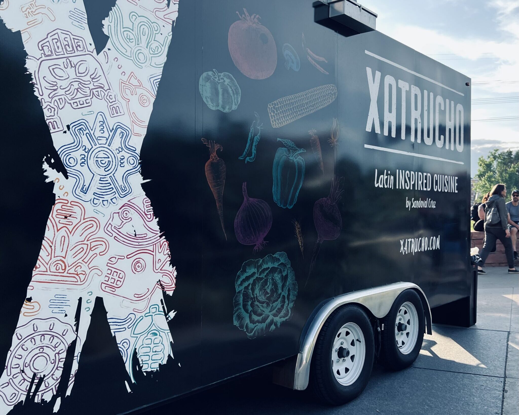
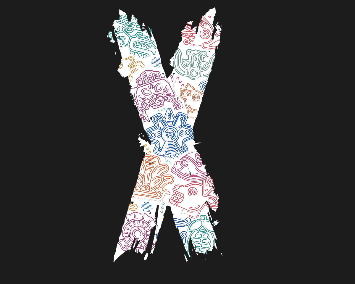
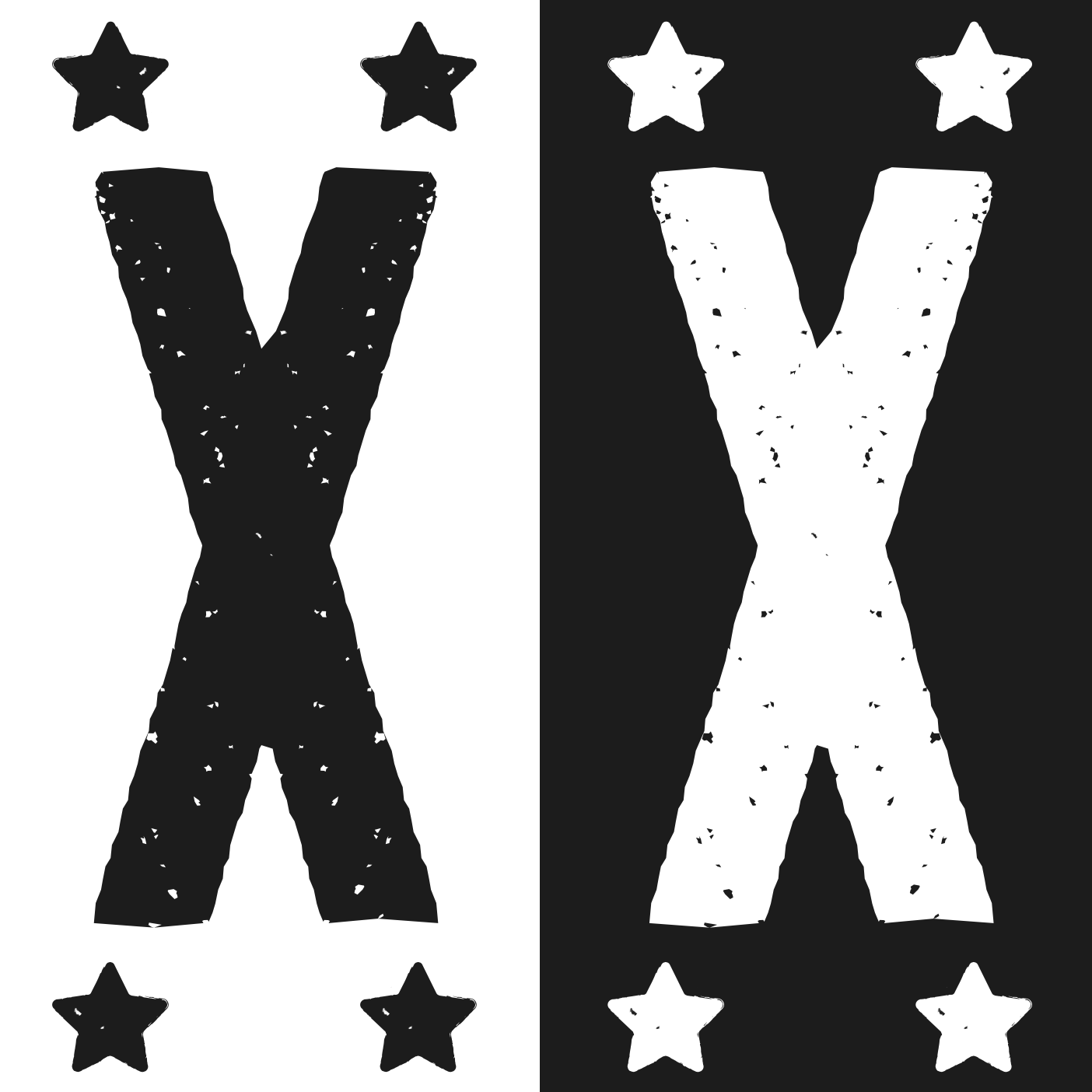
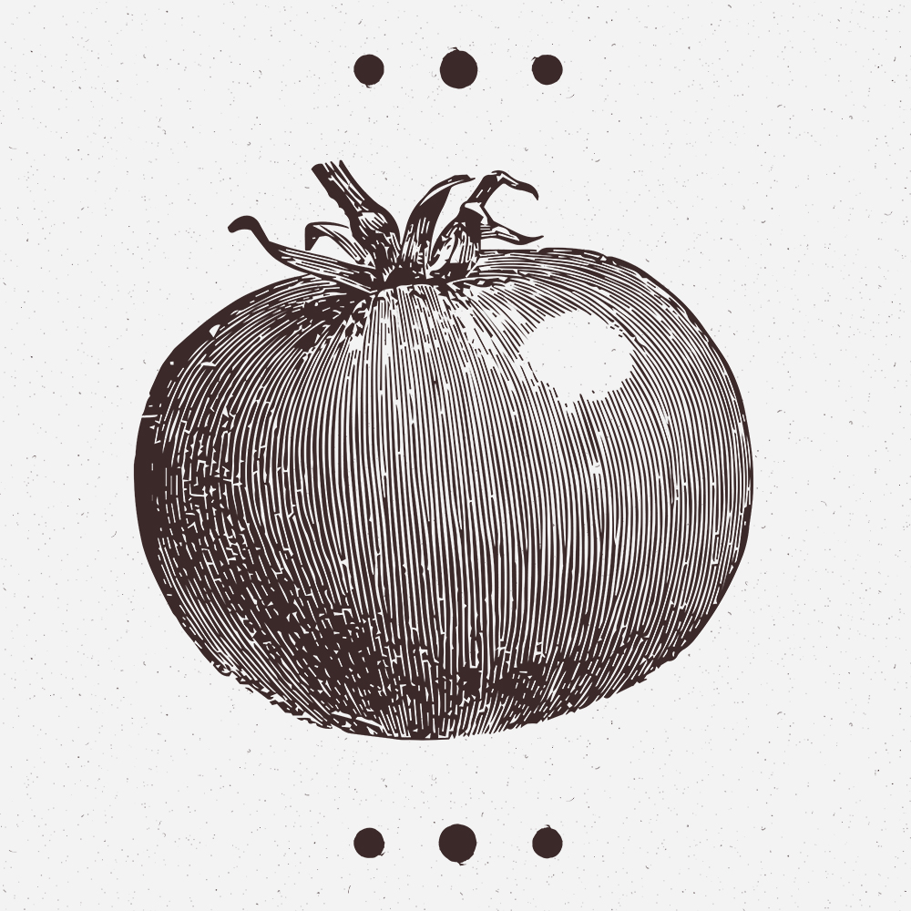
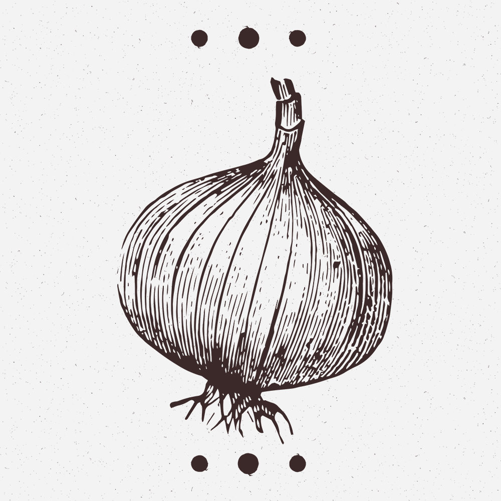
A restrained off-white and off-black palette establishes sophistication, while custom typography and wood-block inspired illustration introduce warmth and heritage. The system was designed to feel artisanal, intentional, and personal — mirroring the care behind each dish.
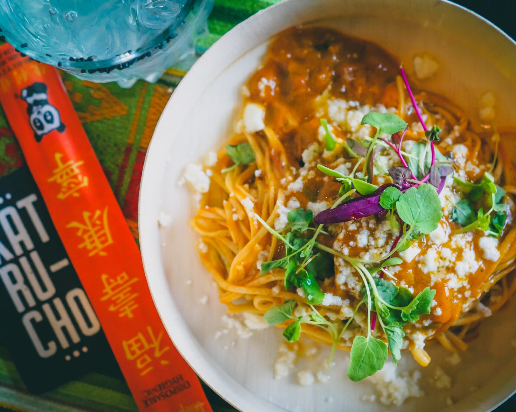
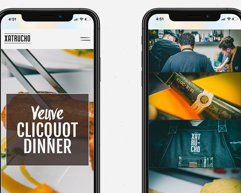
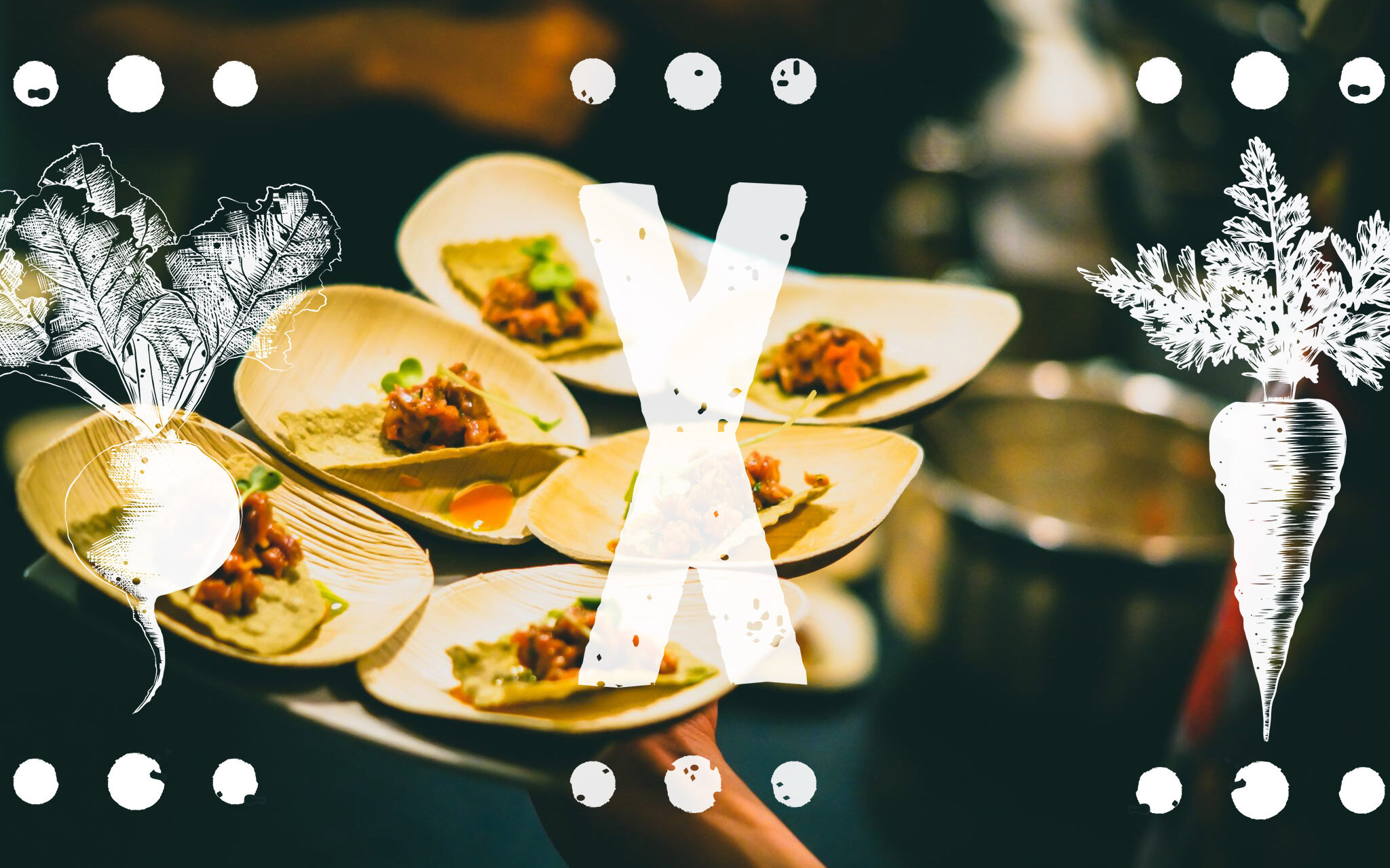
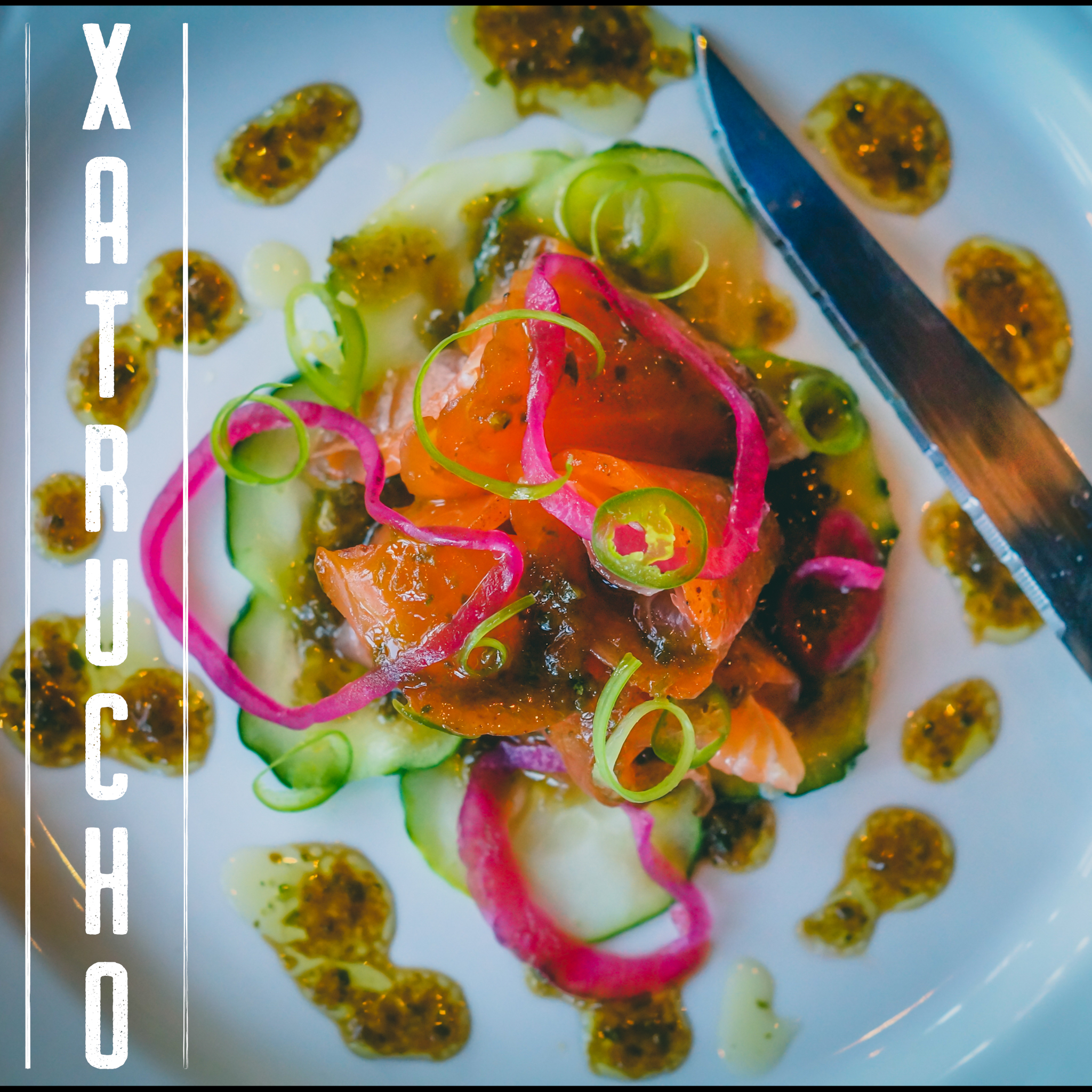
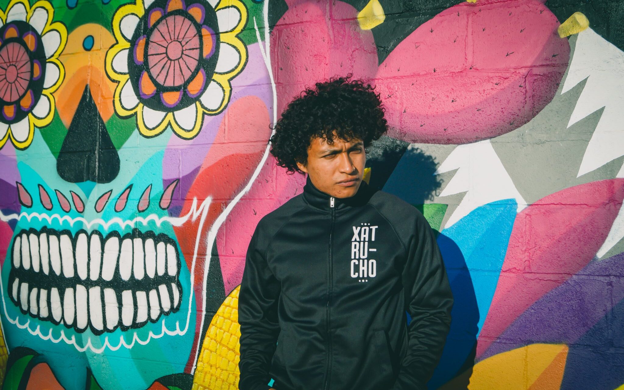
Photography and social assets extend the identity into real-world experiences, ensuring the brand feels cohesive whether encountered online or at a private event.
What We Did:
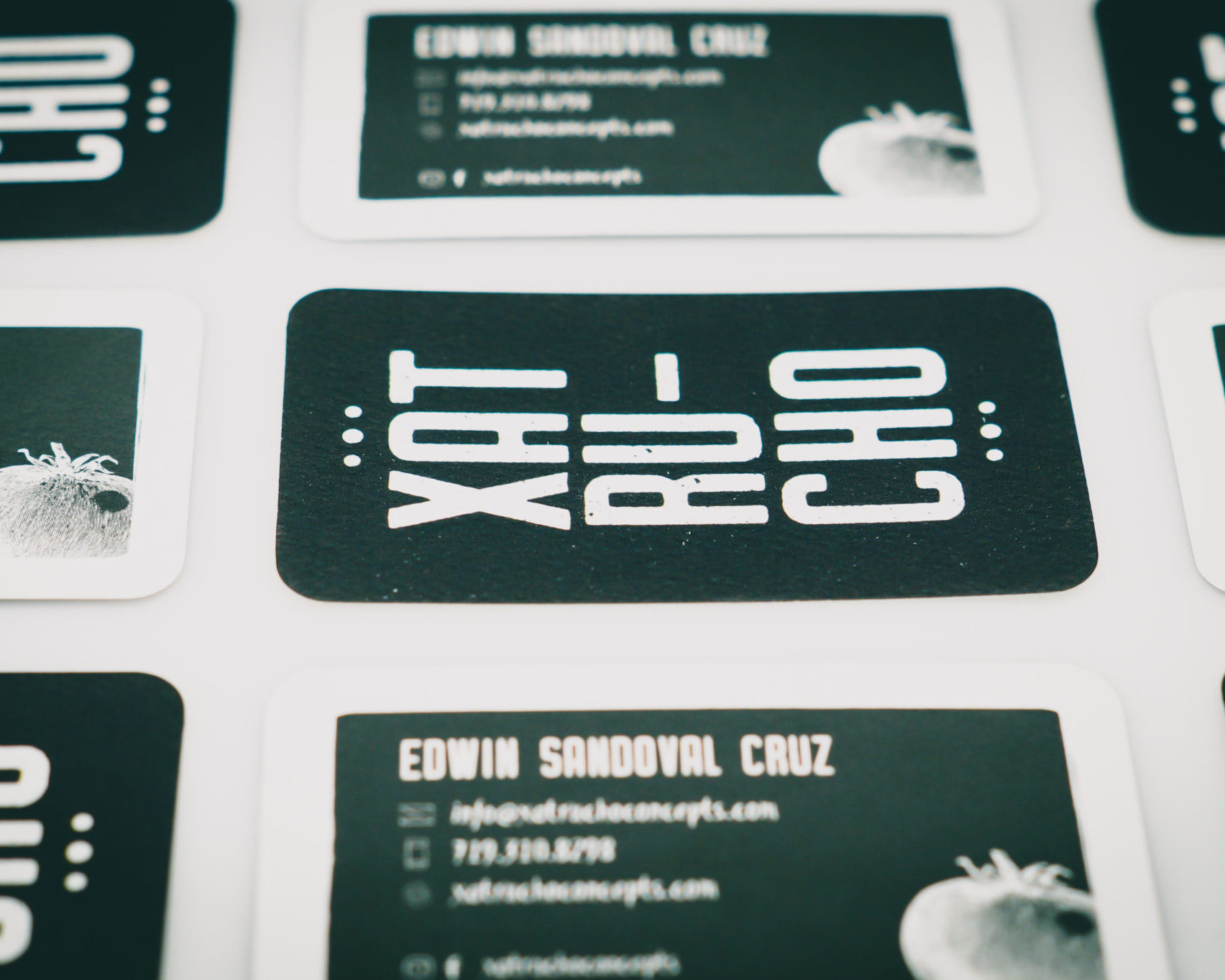
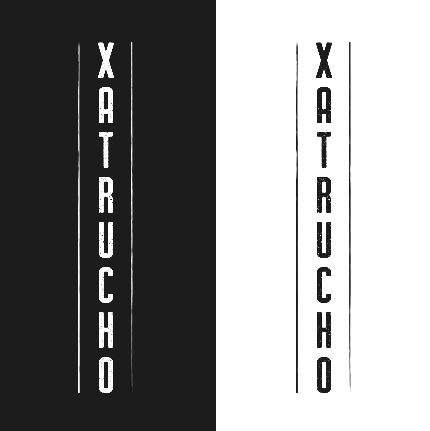
- Designed a custom logotype and identity system with wood-block inspired typography
- Created a signature illustrated tomato mark and supporting vegetable icon set
- Established a refined monochromatic color framework
- Directed event photography and social media visual language
- Delivered brand guidelines and scalable assets for ongoing use


Results:
Xatrucho launched with a distinctive identity that reflects the depth and intention behind the cuisine. The brand now presents a cohesive, elevated presence across events, digital platforms, and client touchpoints.
The visual system supports growth while reinforcing what makes the experience memorable: culturally rooted cooking, thoughtful sourcing, and a chef driven narrative that resonates with a discerning, experience focused clientele.
A strong concept gained an equally compelling presence.
“The most on point branding I could have ever asked for.”
Edwin Sandoval Cruz – Xatrucho Concepts